Modern Calligraphy for Beginners: Essential Tips for Elegant Lettering
Learn the tools and strokes behind modern calligraphy, then turn your practice into cards, place cards and lettering that feels like your own.
Key takeaways
- Brush pens are a low-mess way to start; dip pens offer flexible nibs and more control over ink and line variation.
- In pressure-based calligraphy, use a light touch on upstrokes and add pressure on downstrokes.
- Practice basic strokes before working through a full alphabet, then focus on consistent height, slant and spacing.
- Connect letters with entry and exit strokes, but lift the pen when a join looks forced or crowded.
- Test lettering on the same paper you plan to use for cards, envelopes or place cards.
In this guide
- What modern calligraphy is
- Choose a pen that suits your starting point
- Set up your page and hold the pen comfortably
- Practice basic strokes before full letters
- Build letters and connect them clearly
- Develop a style without losing legibility
- Build a routine and make useful projects
- Common mistakes to avoid
- The Bottom Line
Modern calligraphy can look intricate, but you do not need fancy supplies or perfect handwriting to begin. If you want to make a card, personalize place cards or learn an enjoyable lettering skill, a few basic tools and short, regular practice sessions are enough to get started.
This guide explains how brush pens and dip pens differ, how to practice the thin upstrokes and thick downstrokes common in pointed lettering, and how to connect letters without losing readability. You will also find a simple practice plan and project ideas you can use at home.
What modern calligraphy is
Modern calligraphy is a broad, contemporary approach to decorative lettering. It often borrows the contrast of traditional pointed-pen writing, with thin strokes moving up the page and thicker strokes moving down, but it does not follow one required alphabet or historical style.
That flexibility is part of the appeal. You can learn a basic letter structure, then adjust slant, spacing, loops and flourishes to suit your taste. Start by aiming for consistent, readable letters rather than a finished style that looks exactly like someone else’s.
Many beginner tutorials focus on pressure-based lettering. A flexible pointed nib or brush tip makes a thicker line when you press and a thinner line when you ease off. Broad-edge pens work differently: their flat nib creates thick and thin strokes mainly through the angle of the nib, not by pressing harder.
Good to know: The terms calligraphy and hand lettering are sometimes used interchangeably, but they describe different processes. Calligraphy is written in strokes; hand lettering is drawn, so you can build or adjust each letter like an illustration.
Choose a pen that suits your starting point
A brush pen is usually the simplest way to begin. It has a flexible tip and an ink reservoir, so you can practice pressure control without dipping into an ink pot. Brush pens come in different tip sizes and levels of flexibility. A smaller, firmer tip can feel easier to control for small writing, while a larger, softer tip makes broad strokes and flourishes more readily.
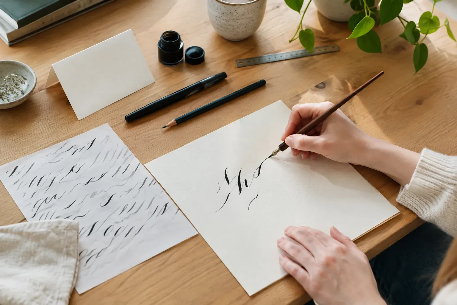
A pointed dip pen has a separate holder and metal nib that you dip into ink. It can produce fine hairlines and expressive thick strokes, but it takes more setup and care. A straight holder is a practical first choice; an oblique holder can help some writers keep a comfortable angle, but it is not essential.
| Tool | What creates thick and thin lines | Good fit for | Main trade-off |
|---|---|---|---|
| Brush pen | Pressure on the flexible tip | Low-mess practice, lettering on cards and larger writing | Tip control takes practice; a worn tip may make uneven lines |
| Pointed dip pen | Pressure flexes the nib tines | Fine hairlines, varied line weight and detailed work | Requires suitable ink, careful dipping and cleanup |
| Broad-edge pen | The nib’s angle and width | Structured scripts and consistent, angled strokes | Does not create the same pressure-based contrast |
You do not need to buy a large kit. Begin with one pen, smooth practice paper, a pencil and a ruler. If you choose a dip pen, add a compatible ink and a small jar or bottle with a wide enough opening for dipping. Read the ink label, protect your work surface and wash ink off skin promptly. Keep supplies away from children and pets.
Pro tip: Try a few pen sizes if you can. The right size depends on how large you plan to write and how comfortable the tip feels in your hand, not on which pen is most popular.
Set up your page and hold the pen comfortably
Use smooth, non-textured paper for drills. Rough fibers can catch a pointed nib or wear down a brush tip, while some thin papers allow ink to feather or show through. For finished work, choose paper intended for writing or drawing and test it with your pen before you start. Glossy surfaces may resist ink or take longer to dry.
Set your paper at a slight angle instead of forcing your wrist into an awkward position. Keep your shoulder relaxed, hold the pen lightly and let your forearm move across the page. A tight grip makes it harder to vary pressure smoothly.
For pointed-pen writing, keep the nib aligned with the direction of your strokes so its tines do not dig into the paper. Use a slant guide if you are working toward a consistent angle. With a brush pen, move the tip smoothly and let the flexible bristles respond to pressure; avoid twisting the tip sharply while it is pressed down.
If guidelines help, lightly mark a baseline, a waistline for the body of lowercase letters, and an ascender line for tall letters. A ruler makes these easier to repeat. Keep pencil marks faint so you can erase them after the ink is completely dry.
Practice basic strokes before full letters
Most lowercase letters can be built from a small set of repeated movements. Practicing those shapes first helps you learn pressure control without also having to remember an entire alphabet.
Start each session with a few slow, even strokes. For pressure-based lettering, think of the basic rule this way: use light pressure as the pen moves upward, and add pressure as it moves downward. Ease off gradually at the end of a thick stroke rather than stopping abruptly.
Try these drills on a page of guidelines:
- Upstrokes: Draw light lines upward, keeping them as fine and steady as your pen allows.
- Downstrokes: Move downward and apply enough pressure to create a wider line. With a pointed nib, press only enough to flex it without forcing the tines apart.
- Underturns: Move down with pressure, curve at the baseline, then rise with a light touch. This shape appears in letters such as i, u and n.
- Overturns: Rise lightly, curve near the top and move down with pressure. This is a foundation for shapes such as n and h.
- Ovals and loops: Make rounded forms slowly, keeping their size and slant consistent. These help with letters such as a, o and e.
- Compound curves: Join a light upstroke to a thick downstroke and continue into another light upstroke. Repeat the movement without lifting, then pause if your hand gets tense.
For brush pens, press with the side of the tip rather than jabbing down with its point. For dip pens, reload when the ink begins to fade instead of pressing harder to force out the last of it. Keep a scrap sheet nearby to check ink flow before returning to your practice page.
Practice slowly enough to notice where your pressure changes. A useful session can be 10 to 20 minutes: spend a few minutes warming up, work through one or two drills, then apply them to a small group of letters. Stop if your hand or wrist becomes uncomfortable.
Build letters and connect them clearly
Once the basic strokes feel familiar, practice letters in groups that share shapes. For example, i, u, n and m use related underturns, while a, d and g involve oval forms. Learning the shared movement makes it easier to spot what changes from one letter to the next.
Keep an eye on four features as you practice:
- Height: Keep short lowercase letters near the same waistline. Tall letters such as h and l need a consistent ascender height.
- Slant: Choose a slant that feels comfortable and use it consistently. A straighter style can look just as intentional as a steep one.
- Shape: Aim for similar widths and curves in letters that repeat, especially inside a word.
- Spacing: Leave enough room between letters for their shapes to remain distinct. Tight spacing can make beautiful strokes hard to read.
To connect letters, pay attention to the exit stroke of the first letter and the entry stroke of the next. Some pairs flow together naturally; others need a small pause or a pen lift. Do not force every letter into one continuous line. A clean, readable join matters more than avoiding a lift.
Practice short, familiar words before writing a full sentence. Try the same word several times, then compare the height, spacing and joins. If one version feels crowded, adjust the spacing rather than adding extra flourishes.
Develop a style without losing legibility
A personal style grows from choices you repeat. You might prefer upright letters, generous spacing, rounded forms, a fine pen or dramatic line contrast. Choose one or two features to explore at a time so you can tell what is improving the lettering and what is making it harder to read.
Use a reference alphabet as a study tool, not a rulebook. Notice how its strokes are formed, then practice the movements before changing a letter. If you add loops or swashes, make sure they do not collide with neighboring letters or obscure the word.
A helpful exercise is to write the same short phrase in three ways: with more spacing, with rounder letters, and with a different slant. Keep the version you enjoy and can reproduce. Save dated practice pages or take photos so you can see which changes are becoming consistent.
You can also combine lettering with other visual techniques. A watercolor wash can create a soft background for a card; test the paper and let the paint dry before adding ink. For ideas on working with color and washes, see Learn Watercolor Painting: Essential Tips for Beginners. If you want to adapt a lettering design for repeat printing, Screen Printing for Beginners: A Step-by-Step Guide explains a related craft process.
Build a routine and make useful projects
A repeatable schedule is more useful than an occasional marathon. Set aside a short practice period several days a week if that fits your routine. Keep the same pen and paper together so setup does not become a barrier.
Use this simple plan for a 15-minute session:
- Minutes 1 to 3: Warm up with light upstrokes, pressure downstrokes and ovals.
- Minutes 4 to 8: Practice one stroke family or a few related letters.
- Minutes 9 to 12: Write short words, concentrating on spacing and connections.
- Minutes 13 to 15: Write a phrase for a project, then note one thing to work on next time.
Start with projects that allow you to write large and make corrections. A folded card, gift tag or place card gives you a clear surface and a useful reason to practice. Draft the wording in pencil first, then mark guidelines lightly if needed. Write a few practice versions on scrap paper before using the final piece.
For place cards, keep names easy to read from across a table. For a greeting card, leave enough open space around the lettering so the message does not feel crowded. If you are addressing an envelope for mailing, prioritize a clear, correctly formatted address over decorative lettering. Use plain, legible writing for the destination and return addresses, and keep flourishes away from the postal information.
Test your finished-paper setup before making a batch. The same ink can behave differently on different papers, and a surface that looks smooth may still feather or resist ink. Give the ink time to dry before stacking or folding the work.
Common mistakes to avoid
- Pressing on upstrokes: This makes the thin strokes heavy and can damage a pointed nib. Keep the touch light as you move upward.
- Using too much pressure: A pointed nib needs a controlled flex, not a hard push. If the tines spread too far or catch the paper, ease up and check the nib angle.
- Rushing the drills: Fast strokes can hide uneven pressure and shaky curves. Slow down until the movement is controlled, then gradually work toward a natural pace.
- Changing several things at once: If you alter pen size, slant and letter shape together, it is difficult to know what caused the result. Adjust one feature at a time.
- Choosing unsuitable paper: Feathering, bleeding and snagging often come from the paper, not your technique. Test a small area before starting a finished piece.
- Adding flourishes too early: Extra loops can disguise unclear letterforms or make words difficult to read. Build consistent basic letters first.
- Neglecting cleanup: Dried ink can affect a dip nib, and a brush tip can lose its shape if it is stored carelessly. Follow the tool maker’s care directions, clean dip nibs after use and let tools dry before storing them.
Safety note: Do not leave an inked nib where someone could brush against it, and avoid touching the sharp point. If ink gets in your eyes, follow the product label’s first-aid directions.
The Bottom Line
Start with one pen that feels comfortable, smooth paper and a few basic strokes. Practice pressure, height and spacing before you move on to connected words, and give yourself permission to lift the pen when a join does not flow.
Short sessions and small projects will help you build control without making practice feel like a chore. When you are ready, use your lettering on cards, gift tags or place cards, and keep readability at the center of every design.
Frequently asked questions
Is a brush pen or dip pen better for beginners?
A brush pen is often easier to start with because it has an ink reservoir and requires less setup. A dip pen offers more control over ink and line variation, but it takes practice to manage pressure, dipping and cleanup.
How long does it take to learn modern calligraphy?
It depends on your goals and how regularly you practice. You can learn basic strokes quickly, but consistent letters, spacing and connections take repetition. Short, regular sessions are a practical way to build control.
What paper should I use for calligraphy practice?
Choose smooth paper that does not catch a nib or wear down a brush tip. Test it for feathering and bleed-through before using it for a finished piece, since paper and ink behave differently together.
Why does my pointed pen keep catching on the paper?
The nib may be turned against the direction of the stroke, pressed too hard, or catching on rough paper. Align the nib with your movement, lighten your pressure and try a smoother sheet.
Can I use modern calligraphy on envelopes?
You can use decorative lettering on an envelope, but keep mailing addresses clear and easy to read. Avoid flourishes that overlap address lines, and use plain lettering for the postal information.